

Objective:
To reposition Abra Cut Abra's brand image and successfully launch the second branch in
T Nagar, targeting adults and upscale audience compared to its kid-focused Anna Nagar branch.


DESIGN NO.1
The above newspaper advertisement and flyer design seamlessly integrates illustrations from the rebranding, a captivating copy for target audience engagement, and essential salon information.
Notably, subtle hints of the rebranded elements and emphasis on the new location was strategically incorporated, marking it as the initial ad and flyer released prior to the official launch, effectively building anticipation and brand awareness.


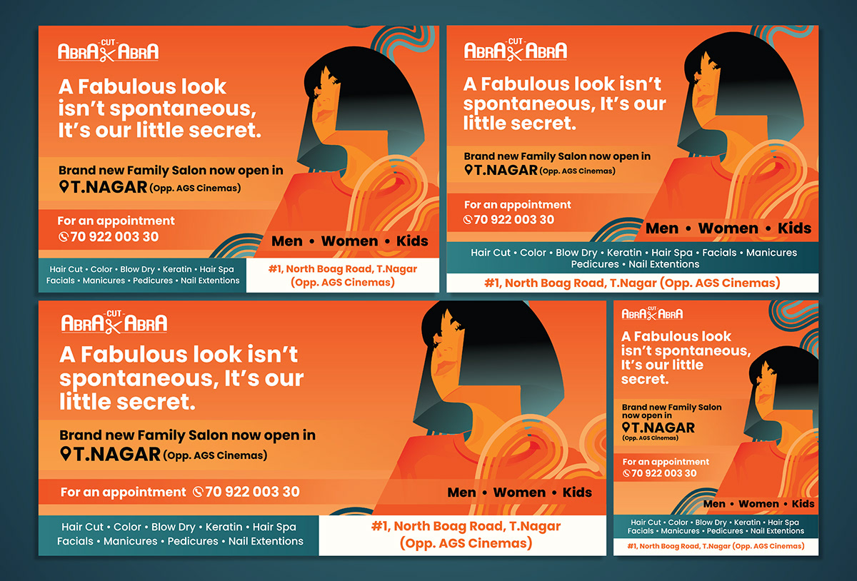
DESIGN NO.2
The subsequent newspaper advertisement and flyer design, unveiled during the official launch, incorporates shades of teal from the rebranding colour palette, reinforcing the brand's
primary teal and orange theme.
Echoing the first design, it blends similar content but specifically places emphasis on the salon's grand opening, announcing its official launch and inviting clientele to schedule appointments.
BILLBOARD ADAPTATIONS
Seven strategically placed billboards in the heart of Chennai served as a powerful extension of the newspaper and flyer showcasing adaptations of the initial design, capturing maximum visibility for
Abra Cut Abra's rebranding campaign.

IMAGES OF PHYSICAL COLLATERAL


